Type Design and the Development of Fonts
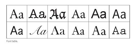 Garamond. Caslon. Baskerville. Bodoni. These names have survived as widely known font types, but their origins go back as early as the 16th century when the expansion of printing and readership called for the development and evolution of type design. Claude Garamond was the first to combine popular roman and italic fonts that were established throughout the 1400s. The balanced look and legibility of Garamond’s type led his design to become the most popular secular typeface for both English and French printing during the Renaissance; in 1541, it became the official font of the French Royal Printing Office. By the 1700s, English engraver William Caslon, working from Garamond’s established roman typeface, developed a slightly shorter and more rounded font that gained much popularity throughout the American colonies. The printed version of the Declaration of Independence features the Caslon font.
With the onset of industrialism, English printer John Baskerville and Italian designer Giambattista Bodoni became leaders in bringing font styles into a mechanical age, moving away from designs that were largely inspired by letters as they appeared on ink and paper. Thin strokes, vertical lines, and precise margins became the distinguishing features of the Baskerville and Bodoni fonts and of modern printing.
Author Solveig Robinson discusses the development of fonts and type design at length in Chapter Three: The Printing Revolution. For more on The Book in Society, please click here.